The Album Covers of Britney Spears: A History
I can't remember what any of the singles from the last four Britney Spears albums sounds like. Early singles like "…Baby One More Time," "Oops! I Did It Again," and even "Not A Girl (Not Yet A Woman)" were catchy and memorable. None of her more recent material has stuck with me in the same way. What's most striking about her discography, for me, is the awfulness of the cover art. Since the cover for her new album, Femme Fatale, has been released today, I think a review is in order.
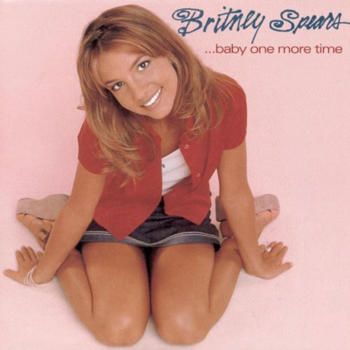
…Baby One More Time (1999): Generic and of its time. It looks exactly like one of the promo images that were mass-emailed to magazines like Tiger Beat, with a logo and album title slapped on in a 15-minute Photoshop session by an intern.
Oops!…I Did It Again (2000): An attempt to be more "adult" and sultry (peering from behind beaded curtains), undermined by, again, terrible typography and what looks like a head-swap.
Britney (2001): The awful color scheme and general washed-out-ness of the photo make this look like it's not even from America; it looks Scandinavian somehow. The logo font is terrible, again, but it's a different kind of terrible—it looks like something from an Opeth single.
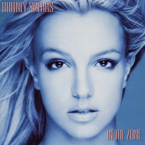
In the Zone (2003): This one is the absolute nadir. The blue-tinted head shot, the stock font; it looks like the cover to a cassette single from 1990 by some dance-pop one-hit wonder.
Blackout (2007): Some people love this one, some people hate it. It looks cheap, as always, with no association between the photo of Spears, the text, those geometric designs, and whatever's behind them. No element is in any way connected to the others.
Circus (2008): This is kind of a step forward, in that it seems like they actually tried to pick a "circus-y" font and color scheme. Spears' ensemble and pose, and the curtains behind her, don't exactly scream Ringling Brothers, though.
Femme Fatale (2011): This looks like the cover to a Britney Spears calendar, with a title font that could have come straight off a disco-era Olivia Newton-John album. (Olivia Newton-John's album covers are a great example of how to do "vaguely vapid blond-girl gazes benignly at the camera," by the way. Britney's team should really do some research into this stuff.) Based on what's come before, it could have been a whole lot worse.
Related: Seven Is A Magic Number
Phil Freeman is the editor of Burning Ambulance and a freelance writer for the Village Voice and lots of other places. He will harangue you at great length about the superiority of Japanese pop if you let him.


I'm actually stunned at how uniformly shit they all are. Poor old Britney, even her typography lets her down.
(Hi Phil! Long time no speak)
Yeah, me too. Not being a fan, I've never seen her album covers before … and man, do they all suck!
itym 'cassingle'
Great showcase of bad.
But as to the actual album content, does Brit Brit cover VU's song?
Little known fact: In the Zone was initially titled The Worst of Sade. The designer never got the memo.
It's also the only cover where I can see her ears, and those ears are freaking me out.
'Britney' was her best look.
Also, who "loves" the Blackout cover? Does even one person not think it's the worst thing ever?
Is she wearing a civil defense helmet in that one?
This is great.
Re: "…Baby One More Time" — I'm sorry, "generic"? " promo images that were mass-emailed"? That album cover was clearly put together by master scientist-perverts so that it was the pure distilled essence of "Here, look up this 18-year-old girl's skirt."
The upturned hem was no accident. The only single item more responsible for her career was the halter-knotted school girl uniform in the video.
If that whole sentiment wasn't standard fare, Britney Spears wouldn't even exist.
The thing that is craziest is that she has this unbelievable team of people manufacturing everything about her 'comeback', and not a single proper art director in the bunch? Makes me wonder if, like how her team lets her wander the streets in torn up outfits and terrible extensions, they somehow allow her to make artistic decisions on cover art, too. For such a managed image, it's also an erratic one.
Right!? I am always wondering about this. Like, there's nobody who can step in and help manage her hair situation? Or choose a font? Who are you people?
Why is her blue head 3 feet long on the "zone" cover? Is this an homage to Rocky Dennis?
Or the inspiration for Avatar?
She has a Hilton-esque wonky eye on the circus cover.
These make me yearn for the tastefully sophisticated art direction of Debbie Gibson's Electric Youth cover.
*swoons*
Where's Choire for this Britney slamming when you need him?
"I can't remember what any of the singles from the last four Britney Spears albums sounds like…and even "Not A Girl (Not Yet A Woman)" were catchy and memorable. None of her more recent material has stuck with me in the same way"
You haven't been listening sir! Firstly: Toxic!!! Secondly: Blackout is a pop masterpiece that didn't get the attention and credit it deserved because Ms. Spears was unavailable for press/touring at that time.
I was about to decry the same thing. Toxic. Toxic is unassailably awesome.