New York City, November 19, 2015

★ Dead leaves, blown high in the air, moved as dark spots like a flock of birds against the gray. The warmth was inappropriate again, the dampness like the aftermath of a summer shower. Some rain passed through, flattening linden leaves onto the pavement. A bearable drizzle came after it at school pickup time, and then an almost unnoticeable drizzle on the walk to the library, accompanied by a colder wind, as if the showers were blowing away. They were not. Outside the library, the newly fallen night came with a full soaking rain, all the way up to the grocery store and back.
Why Announce All of the Layoffs at Once When You Could Parcel Them Out One Day at a Time

When Conde Nast announced yesterday that it was ending Details and re-organizing Self, it seemed that the latter was essentially spared, given long-running rumors that it would be closed as well. According to the corporate memo, it sales department would merely be merged with Glamour’s, “allowing the unified teams will leverage the audience scale of two great brands and create a leading women’s advertising platform for our clients,” brands, engagement, audience, capital, etc. What was left unsaid is that, as WWD reports, Self is laying off fifteen editorial staffers, with the cuts in “the print side in the fashion and features departments, as well as some staffers in its art department,” as well other departments — though “most of the magazine’s senior staff and digital team remain intact.” The Twitter account does seem unaffected.
Meanwhile, the publisher of Conde Nast Traveler was fired while he was on a boat with his national sales staff.
Who knows what fresh efficiencies will be wrought by FTI Consulting’s residency at 1 World Trade Center in the coming weeks? There’s still a whole month until Christmas.
Language, Policed: The Monster of Bad Spelling
by Annie Abrams
Shortly after the 2015 Scripps Spelling Bee, John McIntyre wrote in the Baltimore Sun, “English, a bastard language, abounds in bastard spellings. Those damn Normans grafted all manner of French words onto Germanic Anglo-Saxon, and the learned kept meddling with the language to make it more like Latin.” The idea that American English is a corrupted, mutant flowering of the pure Anglo-Saxon root — onto which other languages were grafted — is not uncommon, but it is insidious. And a few months ago, on Last Week Tonight, John Oliver cited some legislation from 1901 that included phrasing like “Anglo-Saxon principles” in contrast to “alien races” to explain why residents in American territories can’t vote. Today, these references to Anglo-Saxons seem antiquated, to be sure, but they’re less references to medieval history than remnants of how upper-class white Americans understood their national heritage in the nineteenth century.
On December 5th, 1846, in the first issue of a newspaper called Di Anglo-Sacsun, an introductory letter to readers heralded the day when “bad spelling, the monster that scares, and grins at, and harasses the people, will fall into fits, like the Giant Despair of Doubting Castle, and will die outright of his spasms.” During a decade when the country was divided over war with Mexico, expansion, slavery, and immigration policy, spelling might seem like a misdirected use of activist energy. But S.P. Andrews and Augustus Boyle, the editors of the Di Anglo-Sacsun, believed that they could end poverty by making literacy less time-consuming and more accessible, particularly for poor immigrants and slaves. As the written language formalized over the course of the first half of the nineteenth century through innovations like the steam press and energetic lexicographers like Noah Webster, standardized spelling had become a newly erected barrier between the upwardly mobile and those who had neither the time nor the resources to crack the code of literacy.
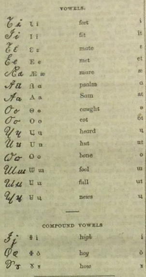
Andrews and Boyle wanted to simplify the process by making spelling entirely phonetic, and even printed the paper using an alphabet called “short-hand phonography” developed by Englishman Isaac Pitman. In “Phonotipy and Phonography,” an essay published in Young American’s Magazine of Self-Improvement — along with pieces like “The Divorce of Learning from Labor” by Horace Greeley and “Great Ideas Free to All Men” by William Channing — Andrews spelled out the merits of phonetic language reform:
The whole business of teaching a child to read, spell, and write…would consist in pointing out the mechanism of the mouth, with its different touches and shapings, and the sounds made by them, together with the letters that represent them. The whole of this, except the period necessary to learn the alphabet itself, would not require a week’s time; whereas it now generally costs eight or ten years of more or less continuing labor in our schools, to learn these arts — and when learned, they are so imperfect that nobody can tell how to pronounce a word correctly by seeing it written.
Di Anglo-Sacsun’s title indicates its aspirational mission: Andrews and Boyle were appealing to a national folk myth about American society’s upper echelons. In an effort to, shall we say, rebrand, many white, upper-class Americans used the label “Anglo-Saxon” self-referentially in the eighteen thirties and forties, regardless of the muddled facts of their real genealogies. Most white Americans, even if they were of English descent, could not be related to Anglo-Saxon ancestors in any traceable way — that population ceased to exist as a distinct group after the Norman Conquest in 1066. Taking liberties with interpretation, self-distinguished “Anglo-Saxon” Americans imagined themselves to be heirs to a medieval culture that prized strength and freedom in the face of oppressors like the Normans. (Thomas Jefferson, whose family was Welsh, wanted Hengst and Horsa, the mythological founders of Anglo-Saxon England, on American currency and hoped all American colleges would teach Old English.)
Andrews and Boyle pointedly explained that they did not choose the title “in a partisan or national spirit, or with a view to render prominent the dysfunction between the different branches of the human brotherhood,” but instead “because it seems to us to contain a proper allusion to the language which it is our primary object to reform.” Although they went on, “We have selected it as the title for our paper, partly for the reason that it has not, so far as we know, been appropriated, and will therefore be distinctive,” another paper by the same name, the Anglo-Saxon, was started in Chihuahua, Mexico, in the same year. The editors of that paper, too, ostensibly believed that their title was politically innocuous; they wrote, “We believe, that the title which we have chosen for our paper, while it is fully significant for our purpose, has nothing in it humiliating or offensive to the people of this State.” It’s strange that these two papers justify their titles in similar ways, given that the former was a liberal reform newspaper and the latter was enacting what John L. O’Sullivan famously termed “manifest destiny.”
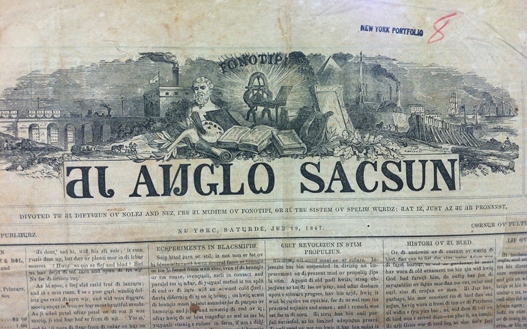
Despite the paper’s assumed heritage, the reform advocated by Di Anglo-Sacsun was advertised as a self-fashioning vehicle for poverty-stricken workers of all races — it reprinted poetry by abolitionist John Greenleaf Whittier, and Frederick Douglass advertised the paper in the pages of his own The North Star. A subscriber wrote in anonymously: “Let the books and papers come to be printed in Phonotypes and no mortal power or vigilance can prevent the slave from learning to read. An hour’s instruction from one who knows how to read will put a learner on the track effectually.” Since the paper was concerned with helping people move up in class, image was an important part of its program. The paper’s masthead is rife with symbols — a train, factory, and steamship emblematize progress, while a providential pyramid and church spire legitimate the endeavor. In the center, a gleaming printing press is surrounded by books, a bust of Aristotle, and a harp, while oak and laurel leaves spill over the frame of the illustration and onto the title itself. The mast is cluttered and over-elaborate, and it points to the frenetic energy of the reformers who published the paper.
Although the paper had the support of six thousand subscribers, in October 1848, it went under after a robbery at the paper’s offices. The spelling reform movement kept on plugging, despite the setback; Andrews and Boyle continued to publish essays in support of the cause, though it obviously failed. Reform efforts today, like the English Spelling Society, established in 2014, cites illiteracy as one of the major reasons people should care about making the written language phonetic, with economic and social equality one of its explicit aims.
And what is good spelling worth lately? A few years ago, the New York Times ran an op-ed by Virginia Heffernan that fetishized typos in the digital age because when spell-check fails because “curious readers…get regular glimpses of raw and frank and interesting mistakes that give us access to unedited minds.” That may be true, but even in the age of emoji and spellcheck, the ability to privilege bad spelling — both as a reader and as a writer — leans in part on being a fluent speller in the first place, certified as worthy to receive, judge, and transmit culture and knowledge. Spelling well is still classy today because it’s still a display of class.
We Used To Get On Line For Music
“In the 1980s and 90s it was not unusual for shops to arrange special midnight openings for the biggest album releases — Michael Jackson, U2, Madonna — and lines snaking around Piccadilly Circus in London, for entrance to the giant branch of Tower Records, were a commonplace on wryly amused TV coverage of those releases…. That reflected not just the popularity of the albums and artists concerned, but also the central place music occupied in popular culture in the past. That place has now been taken by technology — which is why you get queues outside Apple stores when a new iWhatever goes on sale, and why you see groups waiting for the doors of gaming shops to open when there’s a new Call of Duty or Grand Theft Auto or Fifa to be bought.”
David Bowie, "Blackstar"
For any number of reasons I tend not to watch a lot of long videos on the Internet, so it must say something strong indeed about this hour-long BBC documentary on David Bowie’s Ziggy Stardust period that after being deposited there by a YouTube rabbit hole I still stayed for the whole show. Coincidentally, as I finished it up yesterday afternoon, this promotion for Bowie’s latest emerged, which, at 10 minutes, is no small commitment itself. So if you’ve got a good chunk of time this morning and are so inclined, you could watch Bowie at the beginning of his career and then see how it winds down. It’s like the circle of life, or something. Enjoy.
New York City, November 18, 2015

★★ A solid-looking sheet of rippled cloud fell apart quickly, leaving a few drifting bits of white and one last more solid sheet impeding the sun. The temperature was something harmless — too harmless for November, if one took the trouble to stop and think about it, but not warm and sinister. Low stakes for any decisions about wardrobe. There were no shadows out the window, and after a while there was no more blue in the sky. Night came up fast and met no resistance.
The We-Branding of Downtown Manhattan
by Brendan O’Connor
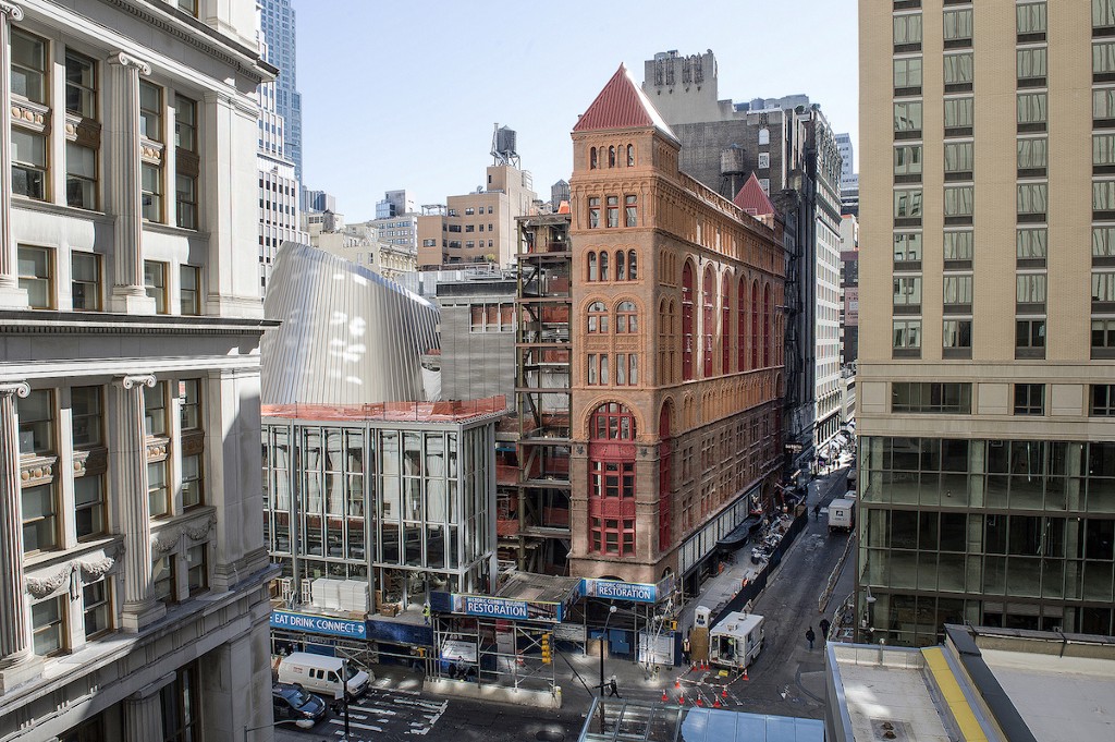
The new Fulton Street Transit Center, where nine train lines come together beneath the glittering oculus of the so-called “Sky-Reflector Net,” opened a little over a year ago to much fanfare more than a decade after part of it was destroyed in the terrorist attacks of September 11, 2001. “New Yorkers, accustomed to thinking of transit hubs like Penn Station and Times Square as places to suffer through, will find on Monday morning a kind of Crystal Palace, crowned by a dome that funnels daylight two stories below ground,” the New York Times wrote of its reopening. Adjacent to the Fulton Center, and providing a street-level entrance to the station is the nine-story Corbin Building.
This summer, the Landmarks Preservation Commission designated the Corbin Building, constructed from 1888 to 1889, a landmark. But when the MTA announced its plans to build a new transit center, it was in sorry enough shape to come under threat of demolition until, in October 2003, the MTA committed to including the building in its vision. The Corbin Building is named for developer and financier Austin Corbin, who died shortly after a violent carriage accident at his house in New Hampshire and is best known now for his management and stewardship of the Long Island Railroad. It was designed by Frances Hatch Kimball, who, in a 1917 story noting his declaration of bankruptcy, the Times described, possibly with some irony, as the “’Father of the Skyscraper’ and Designer of Notable Buildings.” Ultimately, the Corbin Building’s restoration accounted for over $67 million of the $1.5 billion transit center budget.
Having been restored, the Corbin Building now offered some thirty-eight thousand square feet of empty commercial space in downtown Manhattan, right next door to one of the city’s biggest transit hubs, and just down the street from the new World Trade Center. But the MTA is not (necessarily) in the business of building management, and in 2012 it issued a request for proposals, inviting private developers to submit plans for how they would put that space to use, as well as another thirty-thousand square feet of commercial space in the transit center itself.
In December 2013, the MTA announced that an Australian company called the Westfield Group had been chosen as the master lessee. (Last year, the Westfield Group restructured into two, independent companies — the Westfield Corporation now runs things outside of Australia and New Zealand.) About a year later, in the first quarter of financial year 2015 (just around the time that the new Fulton Street Transit Center opened), Westfield leased the Corbin Building to WeWork, a co-working startup based in New York. WeWork signed a fifteen-year lease for thirty-eight thousand square feet across all nine floors. WeWork does not have to pay rent for the first eleven months. This isn’t unusual for transaction of this size, but it does fit into WeWork’s larger business strategy — recently illuminated by both The Information and BuzzFeed — of pushing off expenses as far into the future as possible, while betting, with its $10 billion valuation, that it can attract sufficient membership to eventually meet those (fixed) costs. After the first eleven months, its rent is $50 per square foot for the first five years, $55 for the next five years, and $60 for the next. The net effective rent, then, over the course of the fifteen-year lease, is $51.74 per square foot — a few dollars higher than the average effective rent in the area. (A pretty good deal for the Westfield Corporation, then!) WeWork has heavily invested in the area around Fulton Center: It already has office space at 222 Broadway, and, in 2013, WeWork co-founder Adam Neumann acquired the rights to buy twenty-five floors in the Woolworth Building, at 233 Broadway, for $68 million.
In its development proposal, submitted in response to the MTA’s 2012 RFP, and which I obtained by a FOIL request, the Westfield Group said that it would lease the first three levels of the Corbin Building to retailers and the remaining six as office space, at a rate of two floors per year, starting in 2014. “Therefore, based on current Lower Manhattan office market conditions, we have identified 2017 as our stabilized year (fully leased),” the proposal reads. It would seem things are ahead of schedule.
The first three floors were primarily to be used for luxury women’s accessories, Westfield proposed: “Under Westfield’s plan, this space will be utilized for one or up to three signature specialty retailers who will hold a very special Broadway address and truly unique space.” The office space, meanwhile, was envisioned as “a home to a vibrant mix of ambitious technology firms, media companies, small financial institutions and boutique architectural and law firms,” according to the development proposal. “Such organizations seek a distinct address and Corbin’s historic jewel-box building clearly presents that opportunity. This is where maturing companies will converge to take advantage of a rare state-of-the-art office building with twenty-four seven (24/7) operational capabilities and direct access to major public transportation lines. The unique loft-like setting with its high ceilings and natural light, coupled with connections to great dining options within the Fulton Center, will create one of the most desirable small-user office spaces in Lower Manhattan.”
Leasing the office space to WeWork is not exactly a departure from this plan, as it is conceivable that WeWork, which largely specializes in subletting over-priced and over-amenitized office space to over-valued startups, could bring in a “vibrant mix” of tenants. What’s less clear is whether WeWork is going to get into retail, or whether that part of the plan has been abandoned. In May, the Tribeca Citizen reported that WeWork applied to Community Board 1 for several liquor licenses under several different LLCs: at the Corbin Building, as WeWork Fulton Center LLC; at 110 Wall Street — where its secretive WeLive project is being explored — as WW Service LLC and The Mailroom LLC; and at 85 Broad Street, as WeWork Social Club LLC. The party never stops. Through a spokesperson, WeWork declined to comment, as it always does. The MTA, through a spokesperson, referred questions about the lease to Westfield, which, through a spokesperson, also declined to comment.
Westfield is a ubiquitous presence in the post-9/11, downtown cityscape. In addition to being awarded control of the retail and commercial space of the sprawling Fulton Center, Westfield also paid the Port Authority of New York and New Jersey $800 million for full control of retail development at the $3.7 billion World Trade Center Transportation Hub, which has been repeatedly delayed by water leaks, and which will also house the $1.4 billion Westfield World Trade Center shopping center, “the most complete retail destination in New York City, the most alluring retail landmark in the world.”
But what Westfield does isn’t just about bringing in retailers and restaurants: It is about creating Dynamic Brand Experiences From Morning Till Night: “Conceived as a high-traffic hub of connectivity, Fulton Center moves commuters, residents, and tourists seamlessly throughout major subway lines and the city — creating targeted opportunities for brand engagements day and night.” What differentiates Westfield from other developers, according to its proposal to the MTA, is “its ability to connect consumers with the best brands, creating communications that lead to a relationship.” Westfield is committed to “delivering one-of-a-kind value propositions by creating ‘Complete Brand Experiences’ and ‘Domination Packages’ allowing brands to govern an entire visual landscape with style and sophistication.”
As always, the MTA’s decision to grant Westfield the master lease at Fulton Center, and the Port Authority’s decision to grant them control of retail at the World Trade Center, is ultimately about money. “We expect to generate enough revenue to maintain the whole complex,” the president of MTA’s Capital Construction division, Michael Horodniceanu, told the Times after the RFP went out. “It would be interesting if we could get a bank as the anchor tenant.” (Austin Corbin’s Corbin Banking Company was the ground floor’s original occupant.) Westfield’s play is to leverage the three hundred thousand people who pass through Fulton Center each day and the five hundred thousand people who will pass through the forthcoming World Trade Center transit hub as not just commuters but potential customers, waiting, at each turn taken through the subterranean labyrinth on their way to their jobs — some just up the steps and around the corner, the creators and makers and entrepreneurs filling the Corbin Building — to be sold something.
Photo by MTA
Emily Wells, "You Dream of China"
If this isn’t music for a dark, wet afternoon I don’t know what is. I usually say “enjoy” but I’m not quite sure what to tell you to do with this one, other than embrace it. It scares me a little, to be honest. Good luck.
A Poem by Shuzo Takiguchi
by Mark Bibbins, Editor
Nocturne
From a glass where birds live
a prisoner removes her gloves.
A moonlight bath gives her the equilibrium of someone in mourning.
Night clearly illuminates everything inside night.
A fountain continually sewed up the wrinkles of an empty bed.
She is as thin as a keyhole.
Soon, inside her pelvis, she felt free.
Between today and tomorrow, a white handkerchief.
An endless vacation of red lips.
The sun is sediment at the bottom of the glass,
together with the sleepless birds.
Shuzo Takiguchi (1903–1979) was a poet, painter, art critic, and one of the most prominent Surrealists in Japan. He spearheaded an interdisciplinary art group called Jikken Kobo (“Experimental Workshop”) which was active from 1951 to 1957. His first collection of poems, The Poetic Experiments of Shuzo Takiguchi 1927–1937, was published in 1967.
*
Yuki Tanaka was born and raised in Yamaguchi, Japan. He is currently a PhD candidate at Washington University in St. Louis.
Mary Jo Bang’s most recent collection of poems is
The Last Two Seconds (Graywolf Press). She received a National Book Critics Circle Award for Elegy in 2007. Her translation of Dante’s Inferno, with illustrations by Henrik Drescher, was published in 2012.
You will find more poems here. You may contact the editor at poems@theawl.com.
Misery Postponed
As someone who is always going on about how awful everything on the Internet is — how soul-crushing, intellect-depleting, energy-sapping and just purely destructive of any decent human impulse that remains to you after the battering you take each day from real life leaves you weakened and susceptible to its horrible poison — I feel like I have the occasional obligation to point out anything I see in my sad, doomed tour of the Internet’s terrible byways that doesn’t make me want to die (an occurrence rare enough that “occasional” is probably an exaggeration). This Guardian series on how to draw is aimed at children, but if you have spent any time on the Internet lately you will be aware that we are pretty much all children now, so it is universal in that way. Hopefully it will give you a few minutes of not wanting to die too!