Website Editor Named
Please join us in saying hello and welcome to the new editor of The Hairpin, Haley Mlotek, who you may remember around these parts for advocating for Showgirls, the end of Vogue, and manifestos that demand the death of all men. Even though she is Canadian. Hi Haley!
Post-Text is the Most Text
Felix Salmon, April, on his surprising new job:
But the core of what I do at Fusion will be post-text. Text has had an amazing run, online, not least because it’s easy and cheap to produce. When it comes to digital storytelling, however, the possibilities — at least if you have the kind of resources that Fusion has — are much, much greater.
People batted around that “post-text” line for a while, made their jokes, and forgot. Now, today:
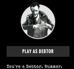
My first #post-text project for Fusion: Bad Paper, a game which should help people understand the world of debt collections in a fun, immersive way.
Bad Paper is a choose-your-own-adventure-style game, turning what would be rhetorical questions in a story’s copy into actual questions with answers you can click or tap. It’s smart! (Or maybe I’m just smug about my success at virtual ruthless debt collection.) And is was coordinated with a long and traditional Times magazine piece, which, after playing this game, I am very slightly more likely to read.
One interesting thing about “post-text” is that it’s full of text. So now we know: It’s “post” as in “post-rock,” not “post-apocalypse.”
Budapest, August 13, 2014

★★ The comings and goings of the sun among the clouds made the difference between oppressive and pleasant humidity. A thrumming pump truck cleared out a portable toilet on a narrow lane, and the smell traveled down the lane in advance of it, on otherwise undetectable air currents. The blue in the sky made the turquoise sky of a mural look garish and implausible against it. Out on the broader street, a full white haze filled the view ahead. Up a lane again, in the courtyard of a bistro, there was full shade. A young man, absorbed in his mobile phone over his beer, allowed his cigarette ash to grow unattended. No sooner had the smoke crept out to fill the space, though, than a breeze through the hallway dispersed it. By the end of a slow plate of duck and beans, the streets outside had cooled as well. The contrast between the shadowed roadway and the bright roadway of sky above was too much for the cameraphone to balance out. A coffee shop was about to close, but had iced coffee still. “Would you like that over ice cream?” Why not. The afternoon grayed over, but a flattering late light came back through. A gibbous moon, through a loose veil of clouds, looked down on the way to the gelato-and-liquor stand.
"Sketch" Is a Lie
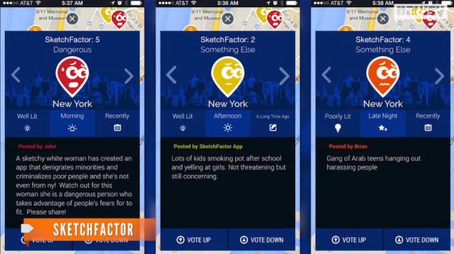
The SketchFactor app, which is intended to provide users with warnings as to the location of “sketchy” neighborhoods, was launched last Friday to near-universal howls of protest. The most common complaint was one of racism. Among dozens: “White duo behind app to avoid ‘sketchy’ neighborhoods is shocked to hear it’s racist,” said The Raw Story; “Smiling Young White People Make App for Avoiding Black Neighborhoods,” wrote Sam Biddle in Valleywag.
SketchFactor works like this: users can tag locations with their impressions of “sketchiness” determined according to the “Sketch Point Legend.” In addition to crime, you can report a “Bizarre Discovery” or a “Strange Encounter.” Visitors consulting a map will see all the reports aggregated into little geotags expressive of varying degrees of worry — the highest score, of 5, is expressed by a distressed-looking little red dude who is clearly about to burst into tears.
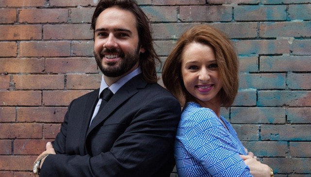
Founder Allison McGuire told Crain’s New York, not entirely credibly, “We are trying to empower users to report incidents of racism against them and define their own experience of the streets.”
“I live in New York now,” the doomed entrepreneur — a Los Angeles native who now lives in the West Village — added “with a laugh.” “So almost nothing’s sketchy to me anymore.”
The disconnect between the comfortably elitist adamantine tech-startup bubble in which SketchFactor was hatched and the world outside became evident almost instantly. A news crew in Washington, D.C. was robbed as they reported on SketchFactor the day of launch (the app went unnamed in the segment, but was described as “an app that warns you about sketchy neighborhoods”). This incident sadly recalled Biddle’s warning on the comments thread of his piece just hours before: “If you think you need an app in order to avoid perceived threats, YOU ARE GOING TO GET MUGGED.”
It’s difficult to fathom, from even a cursory glance at the graphics, how SketchFactor managed to get all the way through development. But is there any way that McGuire and her co-founder, Daniel Herrington, could have pitched their use of this data to the public in a way that would have made it more generally acceptable? Could they have framed it as an app that recommends places to go, for example, rather than places to avoid — like a dowsing rod for gentrification? Can the data they are collecting be somehow combed out into a value-neutral state? If so, how? Or is the data collected by SketchFactor inherently polluted, or even in some way immoral?
The answer seems evident from the AOL site Newsy’s report, which unwittingly provided the most potent criticism of SketchFactor so far. As correspondent Mikah Sargent mooted the question of racial profiling (“for what it’s worth, of the one hundred reports we viewed, seven mentioned race”) a striking but unrelated image appeared on the screen:
If data can be value-neutral — and therefore valuable for people to use in making their own determinations about what to buy or use, or where to visit — then this is exactly the opposite way to go about gathering it. So far, SketchFactor amounts to little more than a giant comments thread for neighborhoods, and what are comments threads but catnip to those most eager to judge most harshly, and most unfairly?
Even if some sort of perfect data source could exist in ideal circumstances, compiled with the aid of companies or organizations that don’t yet exist, it would not matter: That human beings can be examined and MRI’d and profiled, that somehow an algorithm will emerge which anticipates everything we need, everything we want, is first of all entirely ludicrous; such formulae and experiments and schemes can only be devised according to what human beings already have been, not what they might yet become (what we might call the Minority Report Effect). The poverty of imagination that drives these parched little fantasies is consequently pathetic. Not everything can be measured, thank god. Outlandish surprises are all that have ever saved humankind; to dream of systems that serve only to inhibit the operations of chance, accident or uncertainty is foolhardy. Also just plug-ugly.
It bears mentioning, too, that where there is money to be made, the results are liable to be cooked in a different way. Consider the example of Yelp, with its long experience of collecting and serving crowdsourced data, and the legal troubles it now faces over the deliberate pollution of its results.
Which brings us to the larger practical reason these tools should be viewed with suspicion. Even if SketchFactor could predict with perfect accuracy whether a user might be in some danger of getting mugged, using, I don’t know, some complicated algorithm devised using Google Maps, Facebook profiles, Venmo activity, Foursquare and data of its own, its trustworthiness would always be in question so long as there is a commercial advantage to be gained from exploiting data. Which, in our current situation, means pretty much always.
The Cover Job
by Sharan Shetty
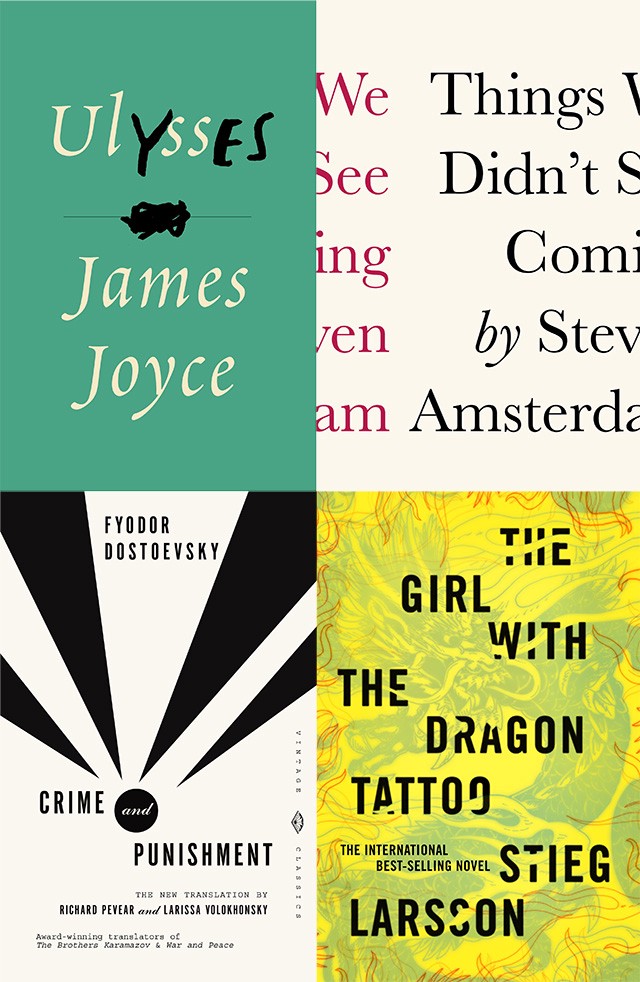
Peter Mendelsund is associate art director of Alfred A. Knopf Books, which makes him perhaps the preeminent expert among those who judge books by their covers. He’s designed covers for everything from The Girl With the Dragon Tattoo to classics by Dostoevsky, Nabokov, Joyce, and De Beauvoir. Last week, he published two books: What We See When We Read, an incisive exploration of the phenomenology of reading, and Cover, a monograph of his best work, which includes his thoughts on designing and several short essays from authors.
I talked to Peter the other day about his work as a cover designer, which began eleven years ago, after a past life as a classical pianist.
So, you were a classical pianist for many, many years, and you mention in Cover that that you still self-identify as such. Is the pleasure you get out of designing at all different than the one you get playing?
Oh yeah, it’s different in kind and degree. The joy I get out of playing piano — there are very, very few things in life that match that particular form of communion. Of course, it’s also hard work, but when it’s going well it’s just one of the great feelings a person can have. If one is playing great music, if you’re playing Bach or Beethoven, and you’re playing it in a way where things are working properly, then your self dissolves, and it’s absolutely a transcendent experience. And nothing, nothing, in design matches that.
It’s not like I’m sitting in front of my InDesign documents swooning. I wish I did. Designing evokes a much narrower range of emotions; that range is somewhere between cool, which is one response, and oh, that’s pretty.
You say in Cover that with book design “clever” and “pretty” are the main benchmarks of quality — that design doesn’t need to deal in profundity. Is that really true, though? Looking at some of your covers, I find profundity. Is that incidental, or do you aim for that?
Well, what you’re trying to do is make something that structurally maps the text. So if there is some unintentional profundity, it has to do with the way the author has written the book and the way the reader has read the book. You’re gonna bring your own experience and feelings to bear on it. I don’t think there’s ever been a moment where I’ve said or felt, “this cover is really profound.” It’s really profundity by association — if it’s a great text, Dostoevsky or whatever, then you connect the experience of reading with the paratext.
You also mention that you can tell at a glance whether a design is working or not. I’ve seen book covers that require a double take, or a look-over, to really absorb. Some of yours, even. Do you relate to that?
The best ones require a double take, and should unfold slowly. It should evolve with the reading. The covers I especially like have tip-offs, so that three-quarters of the way through the book you’re like “Oh, I see.” And the cover sort of then clicks with the text. That’s different, of course, than being able to tell at a glance if a cover works. It’s a different sort of thing. Whether the cover catalyzes with the reader is a separate concern than whether it works on a design level.
I was working on some Calvino redesigns recently, and there were some comps that were funny and pretty, and then there was one that looked a little prosaic. But once I spent a little time with it, it had an element of Easter-egg surprise; it wasn’t static and it seemed to unfold over time, so I went with that.
But how do you avoid the overly clever cover? The punning cover? On-the-nose juxtaposition seems like such an easy trap when designing.
Sometimes winking cleverness is called for, if that’s the tone and affect of the text. And that’s great. I would just say that it’s very hard for a designer not to think in terms of conceptual puns. I don’t know if that’s training or culturation or whatever they teach in the schools — I have no idea what they teach in the schools — but designers really value that idea of cleverness almost more than anything.
It’s a tricky thing to navigate. A lot of these texts that we work on are the result of someone’s blood, sweat, and tears, and the predominant feeling you’re left with after reading is pathos. So, if you then do a cover that’s like “hehehe, isn’t this clever?” it’s a bit tone-deaf. There’s a particular sort of cover that I really don’t like, a sort of punning cover, which is where the cover does the opposite of what the title says. That’s a really common thing. Like if the book is called Thin the type is fat, which is just meaningless and horrible design.
One of the things I like most about your covers are their relative simplicity. Is that a quality you aspire to? Do simplicity and complexity figure at all into your calculus for how good a cover is?
My methodology when I make a cover is to remove elements until I can’t anymore. Frankly, that’s a fault in my process, but I think it’s why you noticed that inclination. It’s great for making simple covers, but there are moments when a text is calling for something really baroque, and I would hope that when that happens I’ll be up to the task. But I think you’re right that it’s a proclivity of mine. I’d really love to do a fantastic maximalist cover, it’s just not my first inclination.
One of your methods is to try to find a single detail that supports the metaphoric weight of the book. How do you know when you’ve found that detail? Is it intuitive or more of a process?
It’s trial and error. The feeling of recognizing that detail in the book is a gut feeling, which comes as it comes to any reader — when there’s a line or moment in the text, and you feel a weight or heft to it, and you think, “There’s something happening here.” Whether that can then be translated into something visual, though, is just trial and error.
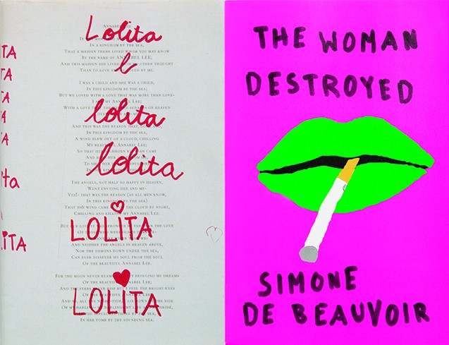
Take your cover for The Woman Destroyed, which I love. How did you arrive at that image, and what was your intent there? It’s so disconcerting, yet utterly effective.
In that case there was also this ancillary, sort of subversive intent. The colors are kind of shocking in their ugliness, and I wanted to do something just for the sheer joy of piquing people. I wanted to do something with a touch of visual ugliness to it.
Right, it’s not classically beautiful at all.
It’s really not, and I intentionally illustrated it in a way that was kind of sloppy. In a way, it was an attempt to illustrate an idea of the text, how society feels toward these broken women, which is just in itself a horrible thing. It’s a commentary on that idea of “we’re done with them, they’re broken.”
One of the things I love about that cover is the abstraction. You mention in your books how abstract covers used to be rare, but they’re now ubiquitous. Is that something you’re happy about?
Yes, for the most part. It’s something I wanted for a long time, and then it happened. I’m happy that it happened, but the part of me that’s just contrarian and impish thinks that if I ever get to design Anna Karenina I’d put a fucking photo on the cover just to mess people up.
But abstraction is a slippery slope, right? Covers can be completely detached from their texts. Or is that alright?
My feeling was always that the minimum bar is, “Can you make something that is not dissonant with your reading experience?” I should also add that I just don’t like book jackets in general. I don’t think I said this in the book, but I’m saying it to you now: I’d prefer if there were no imagery on book covers. But given that we do this, and that we do it with an eye for selling and promoting these books, you could do worse than a cover that just flips people out. The Charlie and the Chocolate Factory uproar that’s happened in the past few days is a great example of that. I really like that cover, which makes me think that I usually really prefer something that’s shocking to something that’s erudite.
What about covers like your Dostoevsky series? They’re just shapes — triangles for Demons, circles for The Double. Is the designing process different for those? They’re so innocuous and open to interpretation.
It’s funny, because at that moment, when I was showing those covers, they were subversive! In the sense that everyone cocked an eyebrow — you know, the general sentiment was like “where’s the painting of the bearded epileptic in Red Square?” There was, in that moment, a little bit of cognitive dissonance with Dostoevesky and suprematism. But once the first cover was approved, and they knew I could do it for the rest of the series, it was just cake. You can’t really go wrong; it’s just so broad and abstract. Those covers speak to the texts in small ways, but they’re really just empty vessels.
So with old classics like the Dostoevsky series, do you feel like you have more latitude with the design? Seems like a different project than designing the cover for a book from the latest unknown in Brooklyn.
The biggest difference for me is that I don’t feel the pressure of a living, breathing author. I don’t need to satisfy them. Which is great, because I feel so bad for these people! To publish a book is just such an intense and exhausting experience, my heart goes out to anybody who writes a novel.
What about the pressure of books — like Lolita, which you talk about in Cover — that are so freighted with imagery and connotation? Do you struggle when trying to escape that visual baggage?
Well, if it’s a book that I really, really love, then in that equation, the pressure is to please myself, and that really sucks. But in terms of a book that — as you put it — has accretions of general visual imagery via all the covers through the ages, that actually just makes it easier. At worst, you know you’re just adding to the pile; at best, what you do can be at the top of the pile.
In general, how do you balance and prioritize the needs of the author, publisher, and readers?
I do think there’s a hierarchy, and that the first responsibility is to the author, which is far and away the most important thing to me. Actually, let me put that differently. The first responsibility is to the author’s text, because the authors themselves are not the most clear-eyed about what the best way to sell that text is. Even setting aside the “selling” aspect, they don’t even have enough distance on what they’ve written to really know how to encapsulate it in any particular way. So the primary responsibility is just representing what the book is, and then after that, the next responsibility is to sell it. Ostensibly, this is a business, and everyone is trying to make a living, so I’d put things in that order. The third responsibility would be to my bosses in the building.
In Cover, Ben Marcus says an author should never interfere with a designer. What are your thoughts on that? Do you ever appreciate author feedback, or is it just a chore that comes with the job?
I’m always wary of it, because knowing a lot about how to write a beautiful sentence doesn’t help you one bit in terms of knowing how to make a book jacket. It just doesn’t. And everyone thinks they have great taste, so my first instinct is always to be a bit wary. But advice from an author is just like advice about anything from anybody — some people are capable of giving you great advice, which comes from a deep well of wisdom, and other people are not so helpful.
You mention in What We See When We Read that when you play the piano, you often miss the mistakes you’re making, just because you’re busy imagining an ideal performance. Does that have an analog in designing? Do you imagine an ideal when designing a cover?
What I do is that when I design something that I like, I’ll say “Good! This is a cover.” Then I’ll print it out, wrap it around the book, put it on my bookshelf, and forget about it. The idea is that I’ll see it peripherally over the weeks, and that’s when I start to learn whether it works or not. Because when you’re working on it, the performative aspect of it takes control, and you start projecting “doneness” on something that may not be done. So that’s one reason I do that; I’d say it’s probably similar to writing. I mean how many times do you write something and say “I AM A GENIUS!”?
Hasn’t happened yet!
Or the opposite! Writing something really crappy, and then coming back to it from another angle. It’s all about getting a little distance and perspective.
When does a book cover’s job end? When it’s picked up? When the book is finished? Is it just a selling point or does it serve a function upon engagement with the text?
The book cover really should unfold over time with the reading experience. When the reader is reading, and the book is over, that’s when it performs its final function. If you finish the book, and maybe even if you didn’t love the book, the cover should still make you want to keep the book, keep it around as part of your life. And more importantly, if you did love the book, then the cover should be something you don’t feel weird about, or something that inhibits the joy of keeping the book around. If it achieves those objectives, then the job is done.
Sharan Shetty is a writer in New York.
Worst Man: I'm the Friend You Didn't Invite to Your Wedding
by Chris Chafin
My friend Stephen planned his wedding very carefully. He picked Howe Caverns, in upstate New York, for the ceremony because it was a favorite weird-but-cool destination of himself and his then-finance. He roped in a mutual friend of ours to perform the ceremony; he timed the whole thing to coincide with the annual Perseids meteor shower. I wasn’t invited.
Stephen told me later that only the immediate families were there. He didn’t want to deal with having a big event, he said — “fretting over orders of centerpieces or picking hydrangeas versus birds of paradise” — or the logistics of wrangling friends to leave the city. “Plus, we knew we’d be having a nice big party here in the city,” he said with a nervous laugh. “You weren’t invited to that, either.”
In fact, none of my adult friends have ever invited me to their weddings. Not Stephen or Tom and Kim or Mary and James or Annabel and Nick or anyone else. When I bring this up, people laugh, and they almost always say, “No! Really?”

It’s not, as it turns out, very easy to ask why you haven’t been invited to someone’s wedding, even if they’ve agreed to talk to you about it ahead of time as part of a totally judgment-free piece that’s really just an exploration and definitely not some bitter, crazy exercise in blame. When the crucial moment comes, they shy away; the conversation sort of steers itself in other directions: Have you run into so-and-so lately? How many kids is it you have these days? It’s like running into a burning building, again and again and again.
The first person I asked was my friend Tom. We first met in 2004 when I moved to New York. He knew many of my college friends, but somehow we never met at school. We hung out furiously for several years; we watched all of Firefly together and went to see Revenge of the Sith with a big group. Eventually, we stopped hanging out regularly (according to Facebook, the last time I’d contacted him was on December 8th, 2007), but we’d still run into each other at parties or concerts and catch up. He married someone else from our social circle last October, and I was not invited. When I messaged him to ask why, Tom told me that he was leaving town for Europe and wouldn’t be able to speak with me. I was a little relieved to escape talking with him. I’d avoided even reading his reply to my message for several days because I had convinced myself that it would be full of angry recriminations — “Why would you ask me this?” We ran into each other at a party a few weeks later, and neither of us brought it up.
Stephen had immediately agreed to talk with me (and, for good measure, sent me an invitation to his baby shower). Though we’ve never really hung out one-on-one, we’ve known each other for about twelve years, since working at the same college radio station; we were part of a crew of several dozen that moved to New York, though only eight of us are still here. When I described our relationship to him as “a long-term-acquaintanceship,” he took exception.
“I’d call you a friend!” he responded quickly. “If you were hit by a car, I’d come visit you in the hospital. I’d watch your cat.”
I was touched. “Would you really watch my cat?” I asked him.
There was a pause. “Wait, do you actually have one?”
I’ve had the same cat since 2003.
Stephen had several theories about why we’re still technically friends, even though we’ve never been close. “Because we’ve never been like super super close,” he offered, “we’ve never had the opportunity to have a falling out.” He also suggested that, after knowing each other for so many years, we have a kind of “common-law friendship.” These were comforting ideas. But it’s hard to deny that some kind of gulf had formed between us over the years: Until our phone call, I hadn’t realized he’d planned his entire wedding in the wake of his father’s death. If I didn’t even know that, why would I have possibly been at his wedding?
Another friend of mine, Mary, got married in May in the barn at Fallingwater, Frank Lloyd Wright’s architectural masterpiece outside Pittsburgh, where she grew up. She was more blunt. “I never thought of you at all!” she told me, laughing. “Oh, God. Sorry!”
I asked Mary if her husband was originally from that area, too. “They’re from here,” she said. “I’m actually from Maryland.” Oh, Christ; I was sure she was from Pennsylvania. Maybe she went to college in Pennsylvania? I don’t know. I had to look up the name of her husband on Facebook.
While speaking, we figured out that it had been at least five years since we saw each other, and those times mostly revolved around Mad Men viewing parties. Still, three of my best friends are also her best friends. Doesn’t this give me some kind of halo effect, a friendship-by-proxy?
“I know you didn’t think — you didn’t really think that you were going to be invited to my wedding,” she said at one point. It would have been insane to invite me. But that doesn’t mean that secretly, somewhere, I didn’t want an invitation to show up in the mail.
The only non-related adult person who has ever invited me to celebrate a marriage was Marie, my very first New York City boss at my very first New York City job. I was extremely young and she much older and wiser; I was 24, and she was 26.
Her ceremony was at a country club-ish place near the water in Massapequa, Long Island, during a hurricane. I was the only person there from work; I remember looking around at dinner and suddenly realizing how thoroughly I did not know anyone else in the room; I had never even met her fiancé before. After the ceremony, it was impossible to find a cab, and so my then-girlfriend and I and rode to the LIRR in a limo with some strangers. I drank too much at the open bar and watched the water smash against the dock outside. Marie was incredibly gracious. We danced together, I think. Maybe? It was a good night.
How did I end up at that wedding and not the others? I realized that in the weeks leading up to the wedding, Marie had been talking about it constantly (as people tend to do) and one day I semi-jokingly said that I was still waiting on my invitation. Ha ha ha. She looked away before saying, “Oh. Ah, yes. Of course.”
That was the only reason I was invited, she told me over the phone. In fact, that’s how many of the other guests were invited. “It’s one of those things like when you’re creating invitations and someone’s like, oh, that would be fun, and you’re like, oh shit, was I supposed to invite them?” she told me. “That happened to me a few times. I assumed if people asked, I was like, okay, sure! I didn’t really know any better.”

I guess I always imagined I’d established some kind of permanent place in the hearts and minds of the people I’d met in my life and that “not talking to someone” was a temporary condition. Maybe it is. But the more births and deaths and weddings and pregnancies you miss, the more you move from “needing to catch up” to hardly knowing someone at all.
We want to believe that there’s order and purpose in the universe, and that things happen for a reason, which we can then understand. The bleak outcome of this process was the discovery that there wasn’t a reason that I had been left out. I didn’t do anything that made anyone angry; I didn’t say anything rude; I didn’t offend anyone by missing a party. It’s just no one thought of me. When they thought of everyone they know who lives nearby and who might want to celebrate a marriage with them, I simply did not cross their mind.
Chris Chafin is a writer living in New York City who finds people endlessly weird and interesting.
Ferguson, Missouri, According to Drudge

“Today Matt Drudge can influence the news like Walter Cronkite did,” Mark Halperin said in a 2006 interview promoting his new book, cowritten with John Harris, who had not yet founded Politico. “If Drudge says something, it may not lead everybody instantly in the same direction, but it gets people thinking about what Matt Drudge wants them to think about.” A late entry in the literature of the Drudge mythology, but a representative one: Drudge drives the news! All hail Drudge, the rascal.
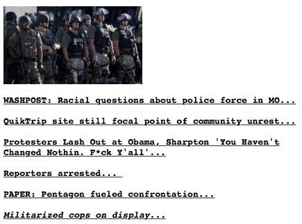
Eight years later, his site looks and feels the same. The same people read it: The establishment crew maybe a little less; the paranoiacs maybe a little more. He has settled into a groove, now that Barack Hussein Obama is president, and it finally feels like we’re starting to get to know the real Matt. Here is his coverage of the events in Ferguson, Missouri, according to the site snapshots at DrudgeReportArchives.com.
August 9th, Saturday: Drudge is on autopilot. Floating somewhere between these two links, which remained untouched about two days, are the words “race war.”
August 11th, Monday, early morning: The situation has escalated. “LOOTING” makes its first appearance; so, too, does the Drudge favorite, Literally Burning America.
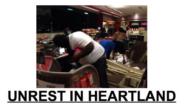
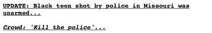
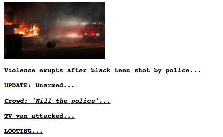
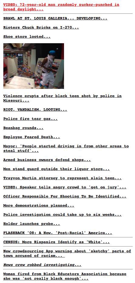
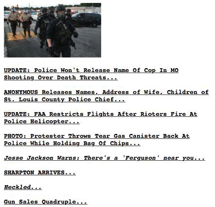
August 11th, noon: The first splash. The coding is dense: Unrest in the heartland; a non-white person taking something that isn’t his. This coverage isn’t early, exactly, but Ferguson wasn’t front page news on most sites — this photo, and caption, are likely readers’ first impression of the situation MO.
The accompanying link rail, on the left side of the page, is laser-focused Drudge: LOOTING; STOLEN; TORCHED; revolution. Businesses are under attack. This is the first appearance of the name “Trayvon Martin.” Obama, too. “Post-Racial.”
August 11th, final edition: An early Drudge narrative is now clear. It is a mixture of “white memory of LA riots” and “white memory of Trayvon Martin.” Robin Williams has died, and Ferguson has been pushed off the top of the page.
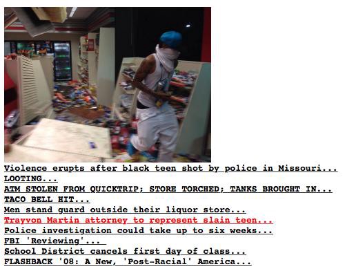
August 12th, Tuesday, morning: The link list is still a harmonious orchestra of dog whistles: looting, riot, vandalism, fear, standing guard, shoe store. The list is now capped on both ends: A “knockout game” story above; stories about Hispanic people identifying as white, a racist-not-racist app for avoiding “sketchy” neighborhoods. A faint suggestion of black militancy serves as a footnote.
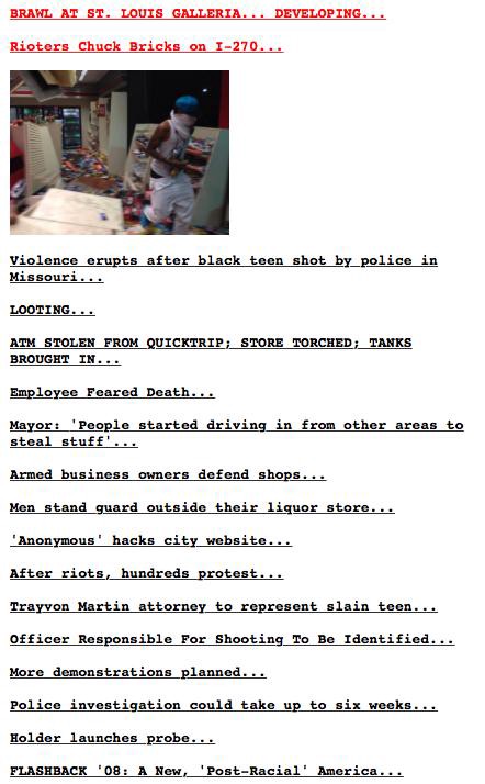
August 12th, midday: Drudge suggests that the hordes are now descending on Ferguson, to loot.
August 12th, final edition: Jackson and Sharpton appear on the page, where they are promptly mocked. Guns. The splash now reads:
“BACALL DEAD”
August 13th, morning: Back at the top of the page.
Here Drudge’s unease about the police intensifies. He begins to become incoherent. The police are fighting the protesters, who he loathes by default; but they are powerful, and represent the state. Imagine the protesters were mostly white, etc.
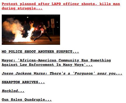
A few hours later: Off the top of the page. The new headline: “Doubtfire did it”
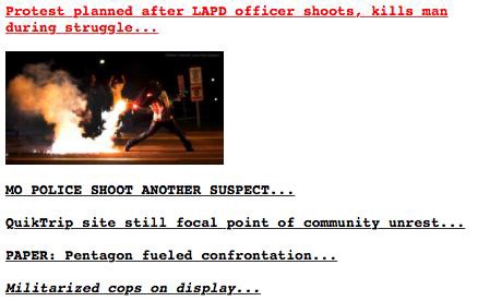
The link list shrinks, a new narrative crystalizes: Drudge has settled, for now, on state power. “Militarized cops.” The Pentagon is involved now. Conspiracy.
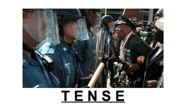
August 13th, final edition: It is no longer possible to hold onto the standard Drudge narratives. Reporters have been arrested, there are now dozens on the scene. Drudge seems to freeze. He attempts to sum up America’s history, as it relates to race, without violating his core principles: “T E N S E.”
Race war. Sympathy for non-whites, insofar as they are unhappy with black leaders.
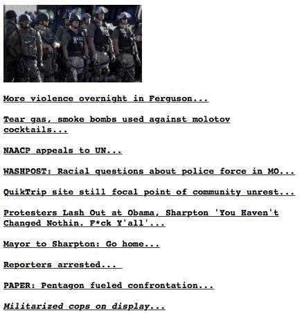
August 14th, morning: A new narrative path forward. Big government versus violent protesters. “Molotov.” The splash is soon replaced by a story about “HILLARY’S HORRIBLE SUMMER.”
And now here we are! Developing…, etc.
Drudge was early on this story — his favorite tropes were all there. Too many of them, in fact, in conflict with one another. So does Drudge still run the news, somehow, in 2014? Does he still “set the tone?”
Really, CNN? http://t.co/wiJyu7Ick5 #Ferguson pic.twitter.com/hpqt1EbOrX
— Matt Yglesias (@mattyglesias) August 14, 2014
— Dorsey Shaw (@dorseyshaw) August 14, 2014
Damn.
*Halperin’s quote to conclude the 2006 interview: “Matt Drudge is not doing stories on policy, on welfare, on healthcare. He’s doing stories on the most salacious aspects of American politics.”
Software Efficient
The consequences of human workers becoming just another piece in the long chain of an algorithm optimized for efficiency above all else
In Brooklyn, Sandianna Irvine often works “on call” hours at Ashley Stewart, a plus-size clothing store, rushing to make arrangements for her 5-year-old daughter if the store needs her. Before Martha Cadenas was promoted to manager at a Walmart in Apple Valley, Minn., she had to work any time the store needed; her mother “ended up having to move in with me,” she said, because of the unpredictable hours. Maria Trisler is often dismissed early from her shifts at a McDonald’s in Peoria, Ill., when the computers say sales are slow. The same sometimes happens to Ms. Navarro at Starbucks.
Budapest, August 12, 2014

★★★★★ Breeze lifted the stars of the EU and Lithuania’s triple stripe on the face of some building, but failed to quite unfurl the folded and misaligned parts of the horse and knight of the Lithuanian presidential banner. A green apple lay on the sidewalk, fallen from an overladen tree. Water plashed quietly in a fountain set with an obelisk, beside the basilica. The office windows were tall and wide open, letting the fresh air blow through, past drooping tree branches. Bells tolled, wheels rattled on the paving stones. The ferris wheel out on the square by the hotel played an English language audio guid to the previous city in which it had been installed. The gondola cleared the rooftops — all the same low-medium height — and discovered the hills beyond. The Danube was green. By the third turn, the interior was getting stuffy. Back down in the park, a violinist played Beatles songs indifferently. The sun shone on the dark gray stone of a building and the blond stone of the same building, where half the facade had been scrubbed clean. Late in the day, an expanse of gray-and-white scales over blue moved slowly northeast along the sky. Behind it came different tones of gray, with occasional spots of bright gold flashing through. In the night, outside a ruin bar, a wide-chested bouncer ate an ice cream treat on a stick.