Candy Company Yet Another Example Of Life's Ineffable Mysteries
“How many licks does it take to get to the center of Tootsie Roll Industries Inc.? No one really knows.”
Star Eats Planet
“Catching a planet in the act of being devoured by a star is an almost improbable feat to accomplish because of the comparative swiftness of the process, but the occurrence of such a collision can be deduced from the way it affects the stellar chemistry. The highly elongated orbit of the massive planet we discovered around this lithium-polluted red giant star is exactly the kind of evidence that would point to the star’s recent destruction of its now-missing planet.”
— Eva Villaver, one of a team of astronomers whose spectroscopic analysis recently documented a red giant star called BD+48 740 eating one of its own planets. This will likely happen to Earth in about five billion years. I am filling up a large balloon with Tabasco sauce and hiding it under my bed, so our stupid sun has a nasty surprise waiting for him when he does it.
Paul Ryan: American Taliban
“Paul Ryan, who teamed up with Akin in the House to sponsor harsh anti-abortion bills, may look young and hip and new generation, with his iPod full of heavy metal jams and his cute kids. But he’s just a fresh face on a Taliban creed — the evermore antediluvian, anti-women, anti-immigrant, anti-gay conservative core.”
— Hey! Maureen Dowd wrote something I like! (Or, you know, maybe one of her friends sent it to her in an email or something. But close enough!)
Dinosaur Jr., "Watch The Corners,"
At the beginning of the new Dinosaur Jr. video, you think it’s set it contemporary America, because of the clothes the teenagers wear and the fact that the protagonist’s boyfriend’s face seems to be cloaked in plasmonic meta-materials. But then the girl pulls out her cellphone, and it’s a Motorola Razr, so we know that the events we’re watching took place a long, long time ago. Dinosaur Jr.’s next album, I Bet On Sky, comes out next month, and I can’t believe how great the old whine-and-squall continues to sound.
About Lester Bangs
“Lester Bangs was a wreck of a man, right up until his death in April of 1982, at the age of thirty-three. He was fat, sweaty, unkempt — an out-of-control alcoholic in torn jeans and a too-small black leather jacket; crocked to the gills on the Romilar cough syrup he swigged down by the bottle. He also had the most advanced and exquisite taste of any American writer of his generation, uneven and erratic as it was.”
Something for Anyone
Tonight it’s the Dadwagon reading in Brooklyn, the Ray Bradbury birthday celebration at McNally Jackson, Sebadoh (and Sentridoh!) at Bowery Ballroom, and the Mark Morris classic Dido and Aneas at Lincoln Center. Plus Pee Wee’s Big Adventure in Central Park, for free! (iTunes)
The Rise And Fall Of Grunge Typography
The Rise And Fall Of Grunge Typography
by Sharan Shetty
Hop on the nostalgia train for a second. Think back to the 90s. To Nirvana, Linklater’s Slacker, and the flannel-clad rebels on the run from the 80s. To skateboards and graffiti and toe rings and VHS tapes. Things were messy then. And type design was messy, too. Words were splayed and chaotic, letters blurred. Textures were thick and heavy. Concert posters looked like someone had splattered paint on paper and then scratched out band names. You may have noticed it, you may not have, but at its peak, this typography style, called grunge, was ubiquitous. Alternative music cds, videogames, and zines — all the aggregate products of a wayward generation — appropriated its unfinished and frenzied aesthetic, and it became the largest, most cohesive movement in recent font design history.
It was everywhere — and then it wasn’t.
THE RAY GUN EFFECT
David Carson, the acclaimed graphic designer who created Ray Gun magazine, is the so-called Godfather of Grunge. His method was simple, his gospel twofold: you don’t have to know the rules before breaking them, and never mistake legibility for communication. Carson’s technique of ripping, shredding, and remaking letters touched a nerve. His covers for Ray Gun were bold and often disorienting. He once disliked a Ray Gun article on Bryan Ferry, and so set the entire spread in Zapf Dingbats.
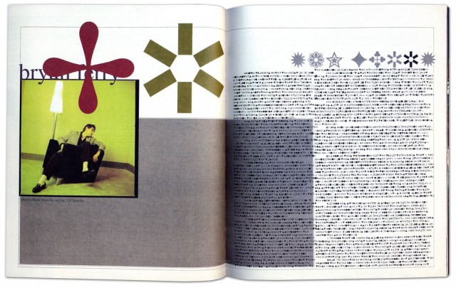
David Carson’s infamous Zapf Dingbats spread, featured in a 1994 issue of Ray Gun. (Via.)
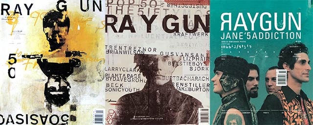
Some Ray Gun covers.
Carlos Segura, a Chicago-based graphic designer and founder of Segura Inc. and such type foundries as T-26, was a close witness to the grunge explosion. Signature grunge fonts, such as Hat Nguyen’s Droplet, Harriet Goren’s Morire, and Eric Lin’s Tema Cantante were all distributed by his foundries.
Like many other of the 90s’ best things, grunge typography was rooted in angst and discontent. “Grunge typography came in as a backlash, very much like how punk music came in,” Segura told me during a recent phone conversation. “It was almost like a societal complaint, if you will: everything was getting too clean. Design by people like David Carson also made it a very accessible direction to go on. We, as human beings, tend to follow more than lead, and everyone just started to do that David Carson look. … And there was, for a certain period of time, a certain refreshing look to it that had not been seen before.”
David Carson on “grunge” design and his method.
The aesthetic was fueled by raw emotion, but Carson’s tactics were made imitable by technology. The rise of grunge typography coincided with the burgeoning popularity of the Macintosh, which, introduced in 1984, permanently altered the landscape of graphic design and typography. The art of designing by hand — a painful craft of precision and consistency — was no longer the only option. Designers were liberated; the screen and their imagination were the only constraints. In many ways, the modifier “grunge” denotes for typography what it does for music: unfettered, unrestrained, a cry against convention. The experimental typographer is almost always the young typographer, and young typographers in the 90s, armed with new software and ideas, rejected the rule-based fonts of their forebears.
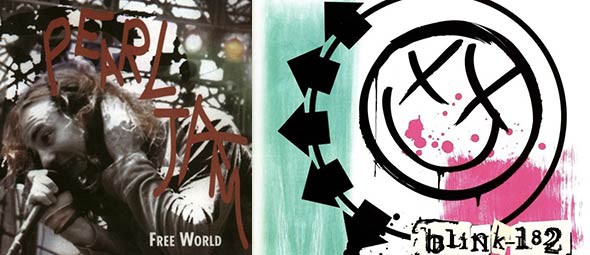
Pearl Jam and Blink-182 were two of many 90s bands that adopted grunge typography in their image.
From the viewer’s perspective, the appeal of grunge was based on a basic idea: it had not been seen before. It wasn’t just the experimental design of the letters, but the way they were placed on page. Its bedlam, its body language, resonated with the culture at large. This resonance produced a vital change in typographic method: in a field that was for decades dictated by the principle of neutrality — of meaning being implicit in the text rather than the typeface — fonts were succumbing to association with the genres or ideas with which they were paired.
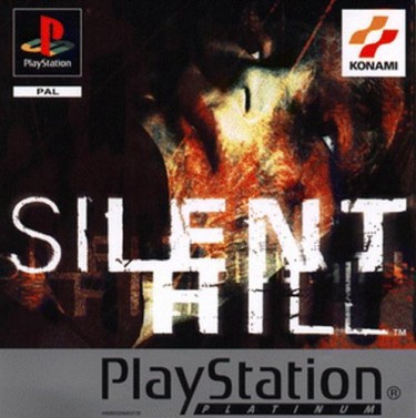
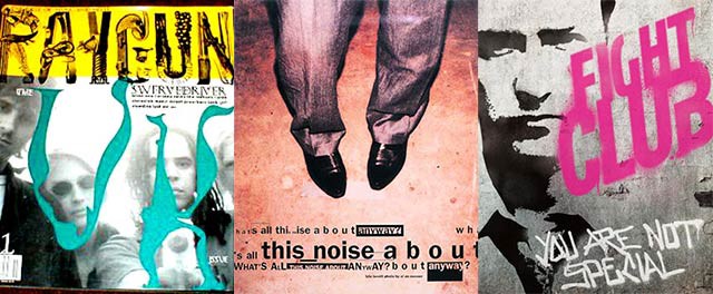
Silent Hill, along with other late 90s videogames, incorporated grunge typography into commercial advertising and covers.
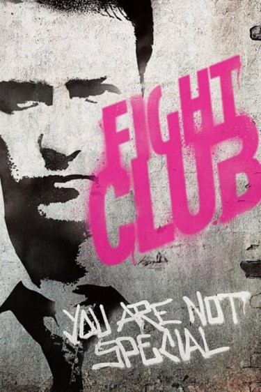
Indie movies like Fight Club often utilized the anarchic look of grunge typefaces.
THE STORY OF A SINGLE FONT
The beginnings of most grunge fonts were couched in moments of spontaneity, rather than purpose and precision. The idea was to instantly express. The story of Harriet Goren’s Morire is an ideal example: the design, inspired by a 16th-century Monteverdi love song entitled “Si ch’io vorrei morire”, is all sketch and shadows, as though the letters are in perpetual and subtle vibration. And yet, for such an intricate typeface, its creation was one of fleeting inspiration rather than premeditated artistic vision.
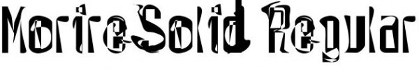
Harriet Goren’s grunge typeface Morire.
Morire-inspired art, created by Goren. (Used with permission.)
“When I made Morire, I had been a designer for a couple of years and was really bored with what I was doing,” Goren told me. “I spent a lot of time looking at contemporary typography and observing what was going on. I didn’t really consider myself part of any movement. I read an article, in Time magazine of all places, of a school in Camden, Maine called the Center for Creative Imaging. The article said it was like being in Florence during the Renaissance. I immediately thought ‘I have to go there.’”
“It was incredibly expensive, like $1,700 for three days, and there was an intensive weekend course called something like Experimental Typography. Now this is 1994 or 1993, so these concepts were fairly new. The teacher was P. Scott Makela, who died fairly young but was brilliant and part of that whole David Carson school. Not really knowing anything about the course, I registered, and paid the massive amount of money. The workshop turned out to be three people and the teacher in the class, and it was basically a three-day intensive experience. We didn’t even sleep. It was just three straight days of type design. They had state-of-the-art computers, at that time Macintoshes, and I had never had facilities like that. Makela gave us an assignment and over the weekend I designed the whole typeface. I wasn’t even on drugs.”
Makela was impressed enough to suggest sending the font to Carson. Goren, flattered and flush with doubt, copied it to a disc and sent it through the mail. A few months later, she bought a copy of Ray Gun; Morire was emblazoned all over the pages, fully credited and even used on the cover. Carson had previously left a voicemail expressing interest in the typeface, but had never guaranteed its inclusion. That was the nature of things: fast, inspired, and without pretense or hierarchy.
“I had no other connections with grunge typography, it was just my being influenced at the time,” said Goren. “I personally thought that a lot of what I was doing, and what other people were doing, wasn’t exactly aesthetically attractive. But I think it was an important step in getting people to break boundaries and really use the computer for what it’s used for now.”
In retrospect, it “was an amazing experience, and one that changed me creatively and entirely, really. At the time, I worked at a design studio and everything had to be done according to clients’ rules. You can do that for so long, but then you need another outlet. It felt very exciting to design letters that didn’t have to be read, in a way. Right after I designed Morire, I broke up with a long-term boyfriend. A friend of mine in Portland asked me to design a spread for his magazine, and I remember using my typeface and thinking ‘I’m gonna make this look really ugly.’ The spread was an illustration of a story, and when I was done you couldn’t read the story at all. It was just an expression of pure emotion and design. That’s really what it was all about.”
Goren’s narrative is not unlike other font designers of the era; Carson was notorious for his techniques, which largely involved slashing letters apart, overlapping and omitting vital words, and wreaking general havoc upon the spreads he produced. There was no method to the madness. At the peak of grunge typography, ideals such as kerning, leading, and spacing were stomped, forgotten, and left for dead. Letters became art. The uniformity of ascenders and descenders, the consistency of x-heights and baselines — these were archaic principles, and had no place in the type designer’s canvas.
THE DECLINE
The old guard was scandalized by this rebellion. In the documentary Helvetica, Maximo Vignelli, an Italian designer strongly based in the classical Modernist tradition, tears apart the extravagant tendencies of the grunge typographers, a “wasted generation” that was not “for anything” but “against everything.”
“There are people that think that type should be expressive,” Vignelli said in the film. “They have a different point of view from mine…You can say, ‘I love you,’ in Helvetica. And you can say it with Helvetica Extra Light if you want to be really fancy. Or you can say it with the Extra Bold if it’s really intensive and passionate, you know, and it might work.” Designers like Vignelli believe that typography should be a shell shaped by words, meant to hold language but never to elaborate upon it. It should, in their view, be unobtrusive, elegant, and, above all, timeless.
Such classical notions may triumph in the end. Somewhere in the mid-2000s, clean lettering and subtle spacing experienced a resurgence in popularity, and the use of grunge typography went into decline: conservative became modern, and chaotic became clichéd. Now, in 2012, this reversion to classicism is nigh complete — during our conversation, Segura noted that most demand for grunge fonts he gets comes from Latin America and Europe rather than the U.S. Segura founded T26 Digital Type in 1994, at the very peak of the movement’s dominance, and initially provided almost entirely grunge fonts. Now, almost 20 years later, T26 has around 100 grunge fonts licensed, but the vast majority of its database focuses on other styles of typography.
“At the very beginning…we were pigeonholed into that grunge segment for a few years,” Segura said. “A couple of years later, we made a concentrated effort to change our personality from a grunge type foundry to a type foundry; we didn’t accept any more grunge or unfinished typography, or fonts that didn’t have a full character set.”
One of those fonts was Goren’s Morire, which T26 stopped distributing in 2004. Demand for such typography weakened as the marketplace became oversaturated with grunge fonts and design trends turned toward simplicity. Ray Gun folded in 2000, one of many print casualties of the decade. And young typographers, once so enamored with the idea of throwing caution to the wind, started realizing the merits of restraint. Slowly and surely, the utility of grunge typography narrowed, until it was applied mostly as a novelty and very often as a gimmick. It began to look cheap, formulaic, boring. The cycle had come full circle, and technology facilitated the end as much as it did the beginning.
“There’s definitely still a conservative, classical movement in the type industry, but I do also think that movement is largely being dictated by web fonts,” said Segura. “Web fonts are obviously for the web, but, more importantly, what’s used on the web is made with the intention of clear readability. That emphasis on readability is really determining the current direction of where fonts are going. That’s exactly why at T26 we firstly focus on web font conversion with the more classical, readable fonts. It’s very rare for a web designer to use an experimental typeface.”
The disappearance of grunge typography can also be credited to human nature: techniques become less appealing, less refreshing, once they are used incessantly for nearly a decade. Cleansed of the burden of precedent, typographers began experimenting within the boundaries of convention. More importantly, grunge typography, like most things that outlive their relevance, simply didn’t possess the power of association or expression it once had.
As Goren put it, “I think after people got that out of their system and realized what they could do with their tools, typography became a lot more classic and reliant on the rules people thought were boring then. Now, pretty much everyone with the skills can design a typeface, so there are so many different voices and perspectives. There’s a lot of mediocrity, because that’s what happens when the tools are distributed to everybody. But I think the pendulum is now swinging toward good, elegant design, and that sort of trendiness of the 90s looks a little dated now. It was definitely a movement of its time.”
These days, Segura believes classic design has been overemphasized and overexposed, to the detriment of the industry. He believes true innovation has become rare. Though experimental typography should never be defined as solely grunge typography, he sees a troubling lack of originality in current type design.
“What I think happened is that it got so excessive that simple, clean typography became the ‘in’ thing,” Segura said. “Almost to the extreme, because then everyone started using Helvetica, and Helvetica was suddenly used as the default answer for every type design project. In my view, that’s also the wrong way to go, because I feel you should pick the right font for the right message. So typography got a little bit too conservative at that point.”
In many ways the demise of grunge is in perfect accordance with its ideals: change is constant, and rules can never be sustained. Despite what the classicists believe, design is not timeless. Neither was grunge typography. It belonged to and defined a very specific period of rebellion. It did so the same way blackletter strongly evokes daily newspapers and stiff men in suits and hats smoking cigarettes, or the way cursive suggests old, coffee-stained diary entries and dusty historical journals. It’s a testament to the enduring power of typography that the way a letter is designed — its curves, its thickness, its heft — can embody an era.
Sharan Shetty is an Awl summer reporter.
Mark Eitzel, "I Love You But You're Dead"
Good news for fans of Mark Eitzel: The former American Music Club frontman has a new record, Don’t Be A Stranger, coming out in October. Here’s the first track.
You Can Watch Your Drunk Video But You Can't Keep It
To Britain, where dropping by an emergency services facility is just the regular ending to a good night out: “Binge drinkers are to be given the opportunity of watching video footage of themselves stumbling into a health centre, in the hope they will reflect on their drunken behaviour.” In case you’re thinking what I’m thinking here, it turns out that the authorities are a step ahead of you:
Nobody would be forced to watch it, [Conrad Edymann, head of substance misuse strategy and development for Cardiff and Vale University Health Board] said, and all footage of a patient would be destroyed when they left the clinic. Patients would not be able to take footage away, he emphasised. Mr Eydmann said that was important because they did not want drinkers misbehaving on purpose so they could have “a trophy item to put up on social networking sites”. “That’s a risk, and that’s why we’ve taken it into account,” he said.
Sigh. It’s like you have to do everything yourself these days.
Christopher Lee's Concept Album: When Saruman Went Metal
by Mike Barthel
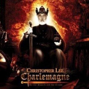
Generally the problem with vanity projects is that the vanity object/subject seems less interested in making a good album than in getting credit simply for having made one at all. But for Christopher Lee, maybe the bare fact of him having recorded a metal album at the age of 88 — Charlemagne: By the Sword and the Cross, a “symphonic metal” rock opera about the titular figure, was released in 2010 — is worthy of praise in and of itself. Still, Lee, who made a veritable mountain of B-movie classics and was a rightfully beloved cult actor even before he played Saruman in the Lord of the Rings movies, shouldn’t be allowed to coast on his reputation, and so will be subjected to the same rigorous critiquing process as our previous entrants endured. Come, let’s learn about the first Holy Roman Emperor, with Count Dooku as our guide!
THE SONGS: If you are familiar with Dwayne’s Franz Kafka rock opera from Home Movies: that, but about Charlemagne. This is not your Tommy kinda rock opera, in which a bunch of moderately connected songs are strung together to form a sort of fanciful, meandering narrative. This is the actual story of the emperor’s life, from point a to point b, the kind of production that’s one slight packaging change away from a spectacularly misguided educational product. These people are sitting you down and telling you about the life of Charlemagne through song. There’s a narrator; different vocalists play different parts, with Lee doing the emperor; and it runs from Charlemagne reminiscing about his life to flashbacks of some of his major battles. So yeah, the songs are 8-minute dramatic recitatives about religion and murder in 9th-century Europe.
THE PACKAGING: You know all those No Limit album covers from the 90s designed by Pen and Pixel? The ones that looked like someone put glue on an unregistered shareware photo editing program and rolled it around in the spangles aisle of a Michael’s? It looks like they got those guys to do it. It looks like they got those guys to do it and then set it on fire.
DID IT SELL? Who knows, but they’re making it into a musical!
CURRENT AVAILABILITY: There are not currently any new copies available on Amazon, at least not any that would ship within the month. But maybe that’s because it’s so popular?
SKETCHINESS OF LABEL: The label is called “Charlemagne Productions Ltd.” Here is a good rule of thumb: when the name of the album also appears in the name of the label, it’s 99% sure to be sketchy.
MOST HILARIOUS QUOTE FROM AN AMAZON REVIEW OF THE ALBUM: “How cool is it to listen to Count Dooku sing?”
WHO MADE IT: Marco Sabiu, who receives the sole writing credit for all but two of the songs, came to prominence in the early 90s as half of the Italian house production team The Rapino Brothers. As “Rapinaton” they had a #22 hit in the UK with “Love Me the Right Way” and did a bunch of remixing. They’re most notable for having produced the majority of the initial version of Kylie Minogue’s Kylie Minogue, the first album she made without Stock Aitken Waterman, the trio behind “I Should Be So Lucky” and other big UK hits. Unfortunately for Marco, the version was scrapped, and only one of the Rapino Brothers compositions ended up on the finished product. (It’s kinda too bad for us, too, since the lost tracks suggest the original concept was much more fun.) After splitting with partner Charlie Mallozzi, Sabiu moved on to more orchestral stuff, and somehow ended up with Lee, doing this Charlemagne thing. Once you get past Sabiu’s name on the credits list, things get murky. Most of the personnel have only this album to their name on Allmusic, and Marie Claude Calvet, who’s listed as the lyricist, is also credited as the stylist on a 2005 DVD by the French artist Zazie. Christopher Lee’s daughter, Chrsitina, does the narration, having played a similar role alongside her father on a Rhapsody of Fire album (more on which below). Her voice doesn’t have quite the same heft as her father’s, but then, whose does?
WHEN HE MADE IT: Christopher Lee specializes in villains. He played Dracula more times than he would have cared to in productions for Hammer, the evil doctor in Gremlins 2, and other notable roles as well. Then film geeks like Peter Jackson started getting giant budgets, and naturally wanted Lee to play villains for them, too. And so in the last decade he’s been in two Star Wars films, an as-yet-to-be-determined number of Tolkien adaptations, and five Tim Burtons, a lovely little career capstone. He’s also done a whole bunch of video games, which makes sense: his voice, so plummily malevolent that it exists nowhere else in nature, is what makes him a perfect villain.
Lee’s been recording music, on and off, since 1973, when he sang one of the songs from The Wicker Man. Then there was the narration for the 1977 folk-rock concept album from two members of Steeleye Span, a song by the Rocky Horror guys in a 1983 superhero parody called The Return of Captain Invincible, and of course the creepy narrator in a 1989 italo disco track (which in retrospect probably served as the inspiration for Ian McKellan’s turn in the Scissor Sisters’ “Invisible Light”). The impetus for our current object of focus, however, was his involvement with the long-running symphonic metal band Rhapsody, who in 2004 got Lee to provide the narration for an album they titled Symphony of Enchanted Lands II — The Dark Secret. This album is like the aforementioned Kafka rock opera except instead of being about a historical figure like Kafka, it’s about how Nekron, son of the Hell God Kron, has written seven books in angel blood prophesizing Nekron’s return and thus the destruction of the world, etc. This gave Lee the bug, it seems. As a result of the Charlemagne album, he was given the “Spirit of Hammer” award at the 2010 Metal Hammer Awards, for being super metal. At the beginning of the promo video for the album, a quote from Lee runs across the screen: “Metal is a way of life. I have been metal for many years only I did not know about it.” This is a reasonably good summary of where Lee was at the time of the album. He had been doing his thing for his entire life, and suddenly what he had been doing fit perfectly with metal albums and mainstream blockbusters, so he did metal albums and mainstream blockbusters.
THE MUSIC: Anyone who’s spent any time poring through old record bins can tell you that a lot of really, really, really weird shit used to get pressed to vinyl. It’s that sort of album, much more so than a contemporary metal album, that Charlemagne takes after. In theory, this fits right into the kind of symphonic metal that Rhapsody of Fire and other bands are making, but in all honesty, there’s a lot more of the orchestral than the metal on display here — not surprising at all, given the backgrounds of the primary people involved. Indeed, this feels a lot like Charlton Heston reading the Bible — or a radio play. It gets a little bit more musical when the group chants “I SHED THE BLOOD OF THE SAXON MEN” but otherwise you really are getting dramatic reenactments of moments from Charlemagne’s life over what sounds remarkably like the Trans-Siberian Orchestra. Is this good? Kinda! Lee is one of the people who truly could read a phone book and have it sound great, so getting a history lesson from Sauruman isn’t an unpleasant experience. If you’re looking to have your socks rocked off, you’ll be disappointed. But if a little historical metal kitsch sounds fun, then Charlemagne might be for you.
Previously: Listening To Lindsay Lohan’s 2004 Album
Mike Barthel has a Tumblr.